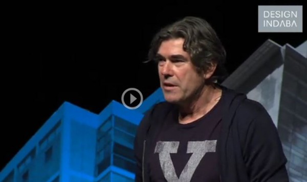
We have been following the work of Clive Wilkinson probably for 20 years now and the studio continually challenges the preconceived notions of what an office should look like and how it functions. In this lecture at Design Indaba last month he looks at current behaviours and way of working.
http://www.designindaba.com/videos/conference-talks/clive-wilkinson-reimagines-workplace-playground
From the Design Indaba web site: (All rights Design Indaba)
“How do we effect radical change in behaviours and ways of working so that our companies can be equipped for dealing with the rapid changes happening in our era?”
That was the question oft asked of South African-born architect Clive Wilkinson. In this talk from the Design Indaba Conference 2014, he explains how he answered this question to clients such as Google, Mother and the Macquarie Group.
Wilkinson looked at the office environment and saw a “thinly conceived” space thought about in “thin financial terms”, where the other spaces in our lives such as our homes had been so “well-considered”. He identified the office space as having been built up from fractured communities. His approach to office spaces is to create for their inhabitants a sense of belonging to something valuable.
His firm employed a six-part strategy to build innovative interior office design:
Culture Model
Wilkinson discusses the transition our culture is undergoing from a mature one – represented by a chain of patronage from rich, older people – to a more open system represented by youthfulness and naivety. “Having an immature condition is actually much freer and more open to experiment and change,” he says.
An example of the freeing effects of immaturity is the design project Wilkinson was commissioned to do for the Disney Store in Los Angeles. He designed a monumental modular honeycomb structure (no doubt inspired by Winnie the Poo), which serves as both furniture and as an architectural wall dividing two spaces.
The Urban Paradigm
This aspect of Wilkinson’s approach translates urban thinking, design and the lexicon of the city into the interiors of large buildings.
He favours this approach because “people understand the cues of the city … it’s a familiar environment and therefore one that one can play with in a meaningful way that creates conversation,” he says.
Wilkinson translates urban spaces in buildings by creating arteries, public connection spots and landmarks in the spaces which makes the space meaningful. The Australian headquarters of the financial services firm Macquarie Group is one such example.
Wilkinson created a vertical village from the traditional high-rise office space by cutting an atrium through the building, connecting different floors with a zigzag red staircase.
The aim is to increase the speed of connection between floors and connect points of meaningful destinations across the buildings. The result is something both fascinating and functional at the same time.
Disruption and Play
Influenced by the notion of “serious play” in the workplace, Wilkinson attempts to build environments and workspaces that foster play and excite people rather than lull them into being overly comfortable. This is achieved through colour and fun that make the spaces feel like alternate realities and shift employee perspectives as a result.
Wilkinson is the architect behind Googleplex, Google’s head offices in Silicon Valley, where the notion of play was vital to the design process.
Fluidity and Transparency
Wilkinson’s approach to constructing office spaces is built on the idea that if you know what is going on around you in the workplace, you will feel more connected to the workplace. The fear with this approach, which does away with cubicles, is that it will be distracting. But Wilkinson has found that it in fact engenders accountability and engagement.
For the London-based advertising agency, Mother, Wilkinson created a monumental 200-seater worktable inspired by the racetrack on top of the Fiat Factory in Turin, Italy.
He convinced the client to erect the large circular table in concrete:
It was completely ridiculous and everyone loved it for that reason. It could have driven a car had it not had breaks in it, he says.
Choice and Diversity
Wilkinson creates environments that suit different types of work and provides a diverse spectrum of collaborative choices to his clients.
Working with Nokia in Helsinki, Wilkinson found that they didn’t quite understand why it is that they needed diverse types of work settings. At the time Nokia had an advert out for one of their models and the tagline read “not one thing but many”. Wilkinson turned this back on them and that sold the idea that they needed different spaces for their employees.
The “not one thing but many” quip is more than just an anecdote; it has become quite integral to Wilkinson’s approach to office spaces, which should serve multiple purposes.
Human Scale, Community and Collaboration
Wilkinson creates manageable groups or tribes in the workplace that do more than give offices a facelift. They give people a sense of belonging to something.
The Barbarian Group commissioned Wilkinson to design a workspace that would foster collaboration and transparency in their company and challenge their creativity. He designed a large-scale table that undulates through the office space and creates not only seating for employees to work, but also semi-private meeting spaces, library space and relaxation spaces in the arches and nooks created by the rippling table.
The office is moving today, and it can move in all sorts of shapes and forms, and people move it as well, he says.
