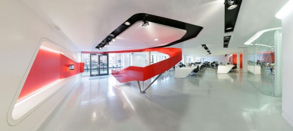
Beautiful interior scheme by Andrew Wallace Architects. We particularly love the reception desk and the way it seems to fold down from the ceiling ope. Great presentation too.
http://www.andrewwallacearchitects.co.uk/code-computer-love.html
from Andrew Wallace Arch:
The brief was to fit out the basement shell of a very ordinary, characterless residential development into Code Computerlove’s new headquarters. Code is a digital marketing and communications agency that rejects a traditional, authoritative hierarchy, instead adopting a more equal, transparent, informal, social and fun approach to their company structure and work ethic.
This work ethic led to an interior layout that rejects the typical grid, uniform pattern of the traditional office environment with its cubicles and cells, in favour of extended linear grouped activities. The curvaceous interior and associated fluidity of the forms allow for a spatial flow that enhances co-operation, communication, creativity and visual stimulus within the company and its various divisions.
A red swirling form serves to entice clients in from the pavement above, where, because of the nature of the site, the building below is not immediately apparent. This form flows down to the building’s entrance where it punctures the facade and morphs into the reception desk, establishing a dramatic and dynamic expression of arrival. Red was used as a bold expressive motif throughout and the success of this approach inspired the client to incorporate it into their corporate branding.
